The advance and decline (AD) index is based on the development of a market or an index. It is shown in a trend line which is needed to draw the correct conclusions. It is an indicator to show the market breadth. The trend line of the AD-index indicates the quantitative development of a market or market segment, whereas a weighted stock index reflects the value-based market development.
Stock indices may still rise when the majority of stocks in the index are already falling. This is possible if some stocks that are relatively heavily weighted in the stock index continue to rise and thus offset the price decline of the remaining stocks. The advantage of the AD index is that is reflects the market and each item in the index has the same weight.
The Advance and Decline index is a technical chart analysis tool which is often used among other technical indicators or chart pattern analysis. To get the actual value the difference between the number of advances and declines is being calculated and added to the previous AD index, usually from the previous day.
AD Index = Prior AD Index Value + (Advances - Declines)
However, the actual value is not of the highest importance as it depends on the starting point of the calculation. The calculation has to start somewhere and the first value is simply the difference between advances and declines (net advances). Therefore, the actual value is not important. The curve will have the same shape whenever you look at the same timeframe but the values depend on the starting date.
How to Interpret the Advance and Decline Index
To interpret the AD index it is important to compare the AD Line of the respective index with the performance of the actual index. The AD Line should be in line with an advance or a decline of the index itself and show similar movements. However, there might be times when the AD index and the underlying index are not in line. For example, an AD line that does not keep up with the underlying index that shows new highs demonstrates that.
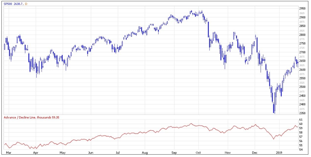
The AD Line is being observed carefully as it peaked during the last crises before the market indices themselves. Therefore, based on past experience, it has been a good indicator to predict a crisis. The picture below shows an example from the S&P 500.
Source and up-to-date data for S&P500 and other indices from Market In Out
Examples for Bullish Divergence and Bearish Divergence can be found here.